

2 weeks x Freelance Project
Software Spelunkers is a small software consulting agency. They offers honest, affordable tech help without the fluff of a big agency — but he lacked a brand identity and digital presence that reflected that mission.
I was hired to lead design across brand and product. This included creating a visual identity system (logo, color, typography), shaping straightforward messaging, and designing a simple, trustworthy website experience that clearly communicates what they do and how they help.
[ Process ]
Research
Define
Design
Test
Launch
[ Software ]
Figma
Adobe Illustrator
Adobe Photoshop
Framer
Midjourney AI
[Delivered]
Developed Site
Logo & Type
Asset Library
Brand Guide
Initial Client Brief & Brand Direction
Through a collaborative process with the Charlie, we defined a brand that feels friendly, smart, and grounded. He wanted his brand and website to prioritizes clarity, speed, and ease of use — supporting Software Spelunkers’ promise to save clients time and earn their trust. Software Spelunkers are the nerd in your pocket. Easy to trust, reliable, honest and respectful.

Research & Discovery
We conducted three rounds of interviews, and found that:
Small business owners feel drained by the time, cost, and complexity of working with typical software consultants.
They want a real human connection, not a faceless service.
Large software consulting agencies are often hard to reach, and get in contact with.
So, we built the brand around Charlie and his team, using the visual identity to highlight their personal, expert support.
[User Interviews, 10 Participants, Ages 30-60]
Branding & Visual Language
I firstly developed a set of brand assets, meant to be used across a variety of channels and graphics. I developed mood boards then created the logo, typeface, color palette, and visual language.
I wanted to create a unique art style, but I lacked the necessary drawing skills to execute my vision. I problem solved by using concise & efficient Midjourney prompts to generate drawings, which were then vectorized and styled in Illustrator, then animated in After Effects.
[Delivered]
Color Palette
Logo & Type
Banner Ads
Asset Library
[ Process ]
Moodboard
Sketch
CADs
Animations
[Tech Used]
Illustrator
Photoshop
After Effects
Midjourney

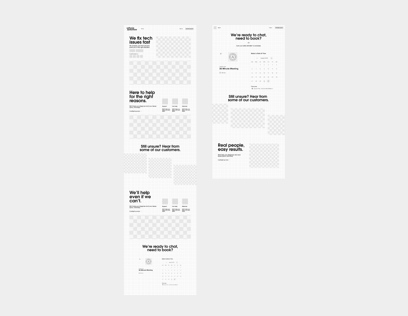
Userflows, Wireframes, Hi-fi Prototypes
I first began by developing two main user flows, booking a consultation and finding answers to their questions. I then sketched out the initial wire frame prototype in Figma, along side a library of components. I then created a hi-fidelity prototype in Figma, and ported the responsive site to Framer.
From this point, we began doing some user testing with our interviewes. From this, we took away 3 main points:
Although the visual language was nice, it felt disconnected from the "real" feeling that they were looking for. They want someone trust worthy and reliable.
The first website iteration did not adequately identity and offer solutions to their business problems.
The customers found the navigation to be too difficult, it prioritized visual elements over proper functionality.
The customers loved elements such as the real time clock on the site, as it shows that the company understands the value of their time, however, didn't enjoy that it was in army time.


Integrating Feedback & Website Updates
After identifying issues after the first round of user testing, the following was updated on the website:
Customers found it difficult to find the website due to SEO. We then shifted our focus toward identifying key words and phrases that were relevant for small business owners, and integrated them into the site functionality.
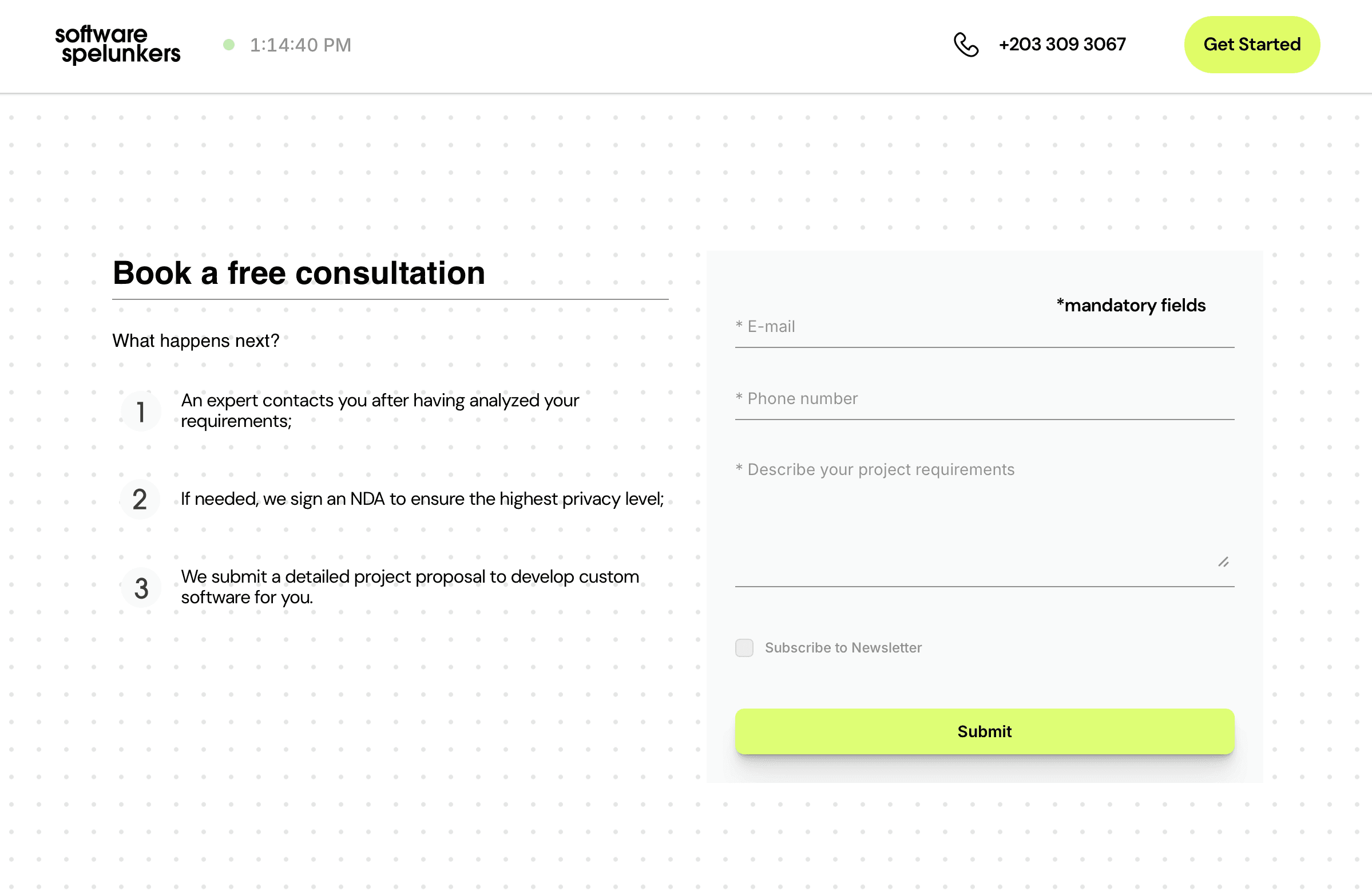
We simplified the navigation. There are now just two buttons, one to call the company, and one to get started. We also changed the real time clock to show AM/PM versus army time. We also added a top banner at the top of the site, directing people to book.
The header image was updated to reflect a more positive association with the business, prominently displaying their "5 star rating", alongside a real business owner quote.
We developed a new section to identify the variety of business sizes they work with, as well as clearly describing the services they offer. These simple product cards contained a large amount of SEO data to improve website searchability.
We developed a customer stories section, to highlight the great experiences that small business owners have had working with Software Spelunkers in the past.
We found that business owners often feel like submitting questions on forms go into "the void" with no response. We included a section next to the form submission to clearly define the process after they submit their question.

Reflection & Takeaways
This project pushed me to grow as both a UX/UI developer and a designer. I developed my ability to problem solve, understand user experience, and craft a strong cohesive visual language to create a functional, user-friendly website. It also deepened my collaborative skills—working closely with the client, incorporating feedback, and iterating with intention to stay aligned with their vision. Additionally, I expanded my toolset by developing my skills in Figma and Framer, using them to solve design challenges in real time.